SWEET THANG SOCIAL CLUB
SERVICES: BRAND STRATEGY | BRAND IDENTITY | WEBSITE DESIGN
THE BRAND
Sweet Thang Social Club is a social club creating spaces & places for young women to try new things, build connections, and find community.
At Sweet Thang Social Club, they believe in the value of creating and maintaining strong female friendships, and their mission is to host activities and events that make women feel free to be themselves and open to new experiences. Their “Sweet Thangs” range from former homebodies looking to get out of their bubble to girlies new to the city looking to make new friends.
THE STORY
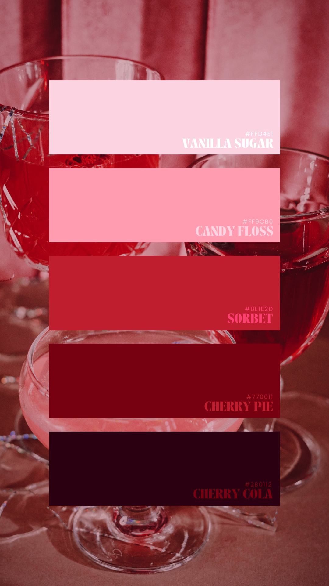
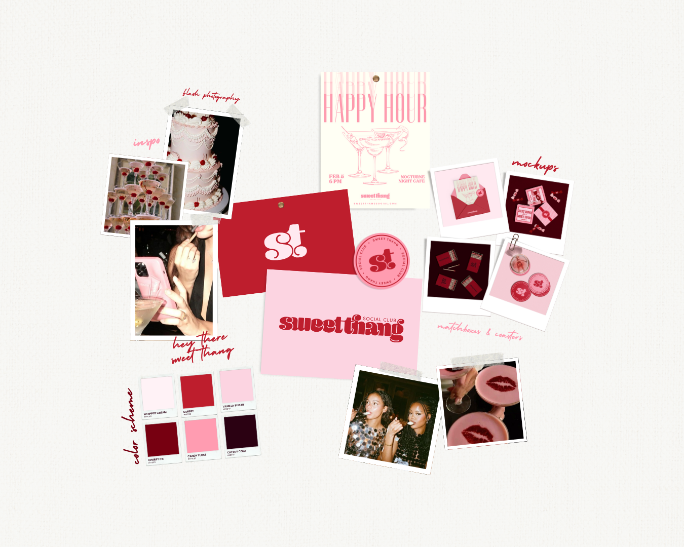
The Sweet Thang brand is an unapologetically hyperfeminine fever dream of pink and red. It’s a sweet and happy safe place for women to have fun and make friends, just like a kid in a candy store. There’s an element of digital nostalgia like the tumblr days of 2011-2015. It’s where you can be the version of yourself you’ve always wanted to be.
ATTRIBUTES: HYPERFEMININE | NOSTALGIC | FUN
THE VISUALS
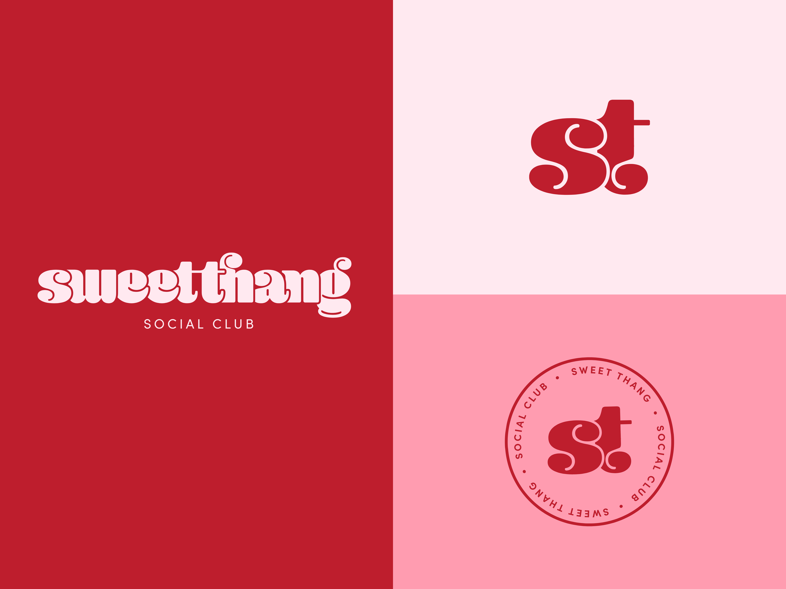
I designed the visual identity for Sweet Thang Social Club to be fun, and feminine, with a touch of retro flair. The rounded lowercase letters are a nod to the 60s and the mini skirt revolution, where women used their fashion choices as a symbol of youthful rebellion and freedom. The color palette is also hyperfeminine, in all pinks and reds. The darker tones help to keep the overall visual identity from skewing to childish, and give it some depth.